Agile Manufacturing Web Design for Better Conversions in 2025


- Fast, intuitive manufacturing websites help engineers, buyers, and procurement teams navigate with ease and act faster.
- Agile web design replaces traditional overhauls with short, sprint-based development cycles for faster, data-driven improvements.
- Effective CTAs and clear content paths help different roles, like engineering and operations, quickly access specs, quotes, and support materials.
- Component-based systems in web design manufacturing allow manufacturing teams to add or revise content without starting from scratch.
- Working with a manufacturing web design company familiar with CRM, ERP, and spec management systems reduces integration errors and delays.
Did you know that website design alone directly shapes how 50% of consumers perceive a business? If engineers or procurement teams visit your manufacturing website and find vague marketing claims instead of spec sheets, certifications, or CAD files, they’ll bounce fast.
Most manufacturers treat their websites like a one-and-done project. Launch it, forget it, and revisit it five years later, by which time products, messaging, and customer needs have all moved on.
That’s why a traditional website redesign no longer works. What you need is an agile manufacturing web design process: fast to launch, easy to update, and built to support real sales conversations, not just look good.
In this article, we’ll break down how to move away from static redesigns and toward a flexible, practical, and conversion-focused approach, also called Growth-Driven Design (GDD).
What Does a User-Centered Website Design Do for a Manufacturing Company?
38% of users abandon websites with bad design. Once your brand is associated with wasted time or frustration, future clicks drop, even if you spend thousands on search engine optimization, Google Ads, and you continuously appear first on Google.
A user-centered website design helps manufacturing companies improve usability, increase lead quality, and support confident decision-making across the buying committee.
Here’s what a modern, high-performing manufacturing website design delivers:
1. Load times optimized for real conditions
Remember that your potential customer isn’t always on fast internet. They’re on shop floors, in warehouses, or remote job sites. Compress spec-heavy PDFs, lazy-load product visuals, and eliminate render-blocking scripts. These steps reduce bounce and support uptime across devices.
2. Architecture aligned with technical buyer behavior
Generic menus don’t cut it. A manufacturing website needs to match how real users search, by use case, material, or performance needs. Add role-specific navigation like “Browse by Application,” “Filter by Material,” and “See Industry Certifications.” This makes product information accessible with fewer clicks.
3. Contextual, task-driven CTAs
Actionable CTAs must match the user’s role and intent.
For example:
- Engineers: “Download CAD File”
- Buyers: “Request Lead Time”
- Managers: “See a Case Study”
Each CTA supports your marketing strategy and feeds qualified traffic into your CRM.
4. Branding updates that improve user experience
In the manufacturing industry especially, modernizing doesn’t mean overhauling. Clean website design boosts clarity and reinforces trust. You can also try to improve logo design sharpness, unify your visual hierarchy, and simplify font usage to keep documents scannable and credible.
5. SEO structure that supports digital marketing performance
In manufacturing, SEO isn’t about high-volume blog traffic, it’s about visibility to the right buyer at the right time. A strong site structure ensures technical specs, datasheets, and product pages are easily found and indexed.
Elements like schema markup, optimized URLs, and internal linking between FAQs and product pages give search engines (and your users) clarity. This is what connects top-funnel interest to bottom-funnel conversion—and it’s foundational to any serious manufacturing digital marketing strategy.
Overall, a user-centered website design reduces reliance on expensive outreach, improves organic conversion rates, and lowers long-term website maintenance costs by making your content system scalable.
For many manufacturers, that means working with a web design agency like O8, one that understands the industry and builds for speed, clarity, and measurable growth.
Our Top 5 Picks for High-Performing Manufacturing Websites
What separates the best manufacturing website design from the rest isn’t surface-level polish – it’s how well the site aligns digital marketing goals with buyer behavior.
Each case below shows how a manufacturing company structured product information, brand visuals, and conversion paths to reduce drop-off and guide potential customers toward real sales actions.
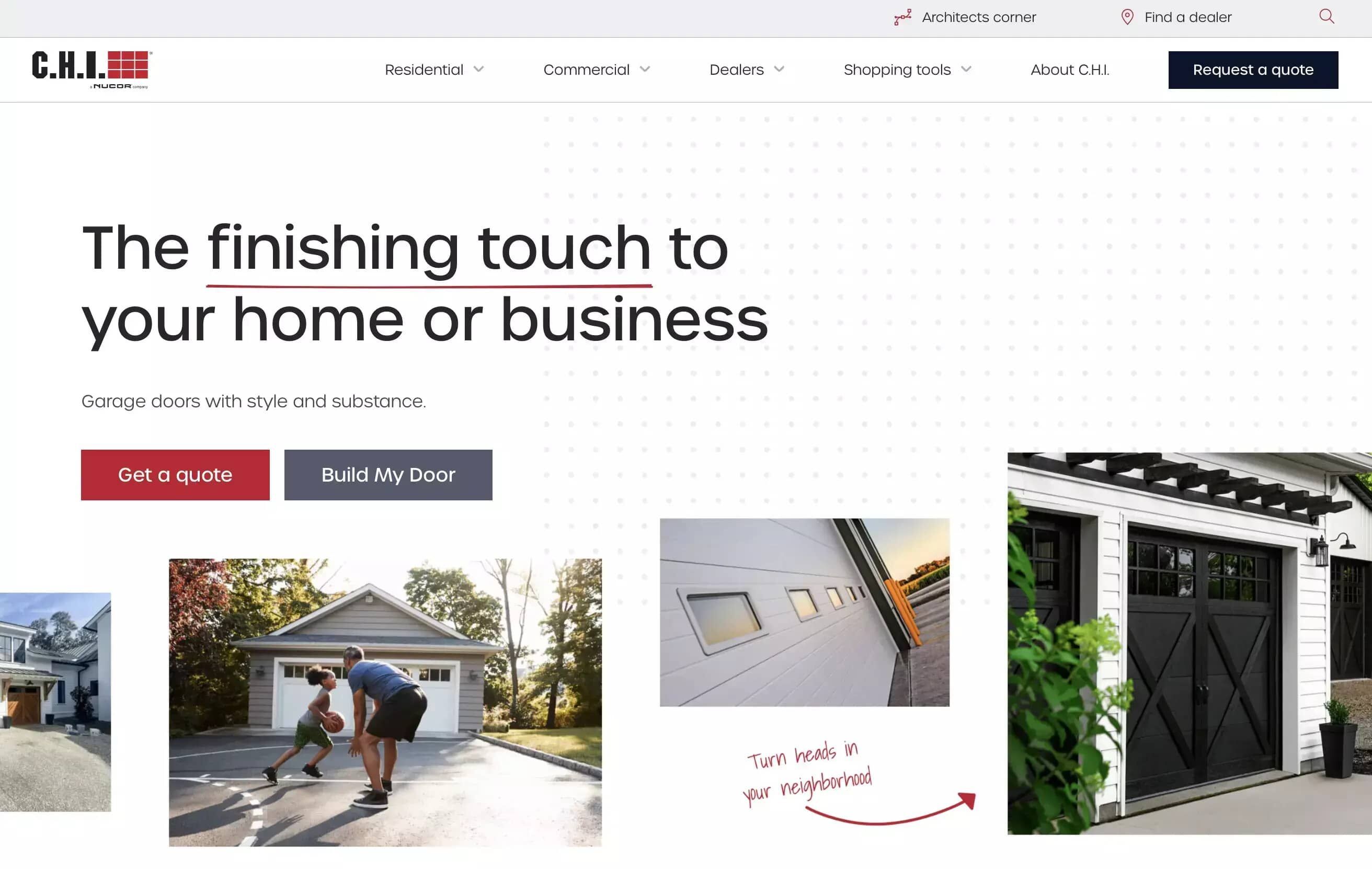
1. C.H.I Overhead Doors
C.H.I’s manufacturing website stands out for how well it separates two distinct audiences (residential and commercial buyers).
Right from the homepage, users are guided into self-segmented paths tailored to their needs. This early choice makes sure potential customers quickly see the product information, tools, and visuals most relevant to them.
Product pages are streamlined and focused, featuring a garage door configurator that allows users to visualize, customize, and request a quote in just a few clicks. CTAs are placed where user intent naturally peaks. They use active, conversion-focused language to help guide the next step.
Hand-drawn accents and clear taglines create a premium feel, but the experience stays fast, scannable, and mobile-friendly. The layout also makes it easy to explore and compare product specs – all very necessary in an effective manufacturing website design.
If your manufacturing company serves multiple buyer types, we’d advise using homepage self-selection and a streamlined configurator to deliver tailored journeys and reduce barriers to engagement.
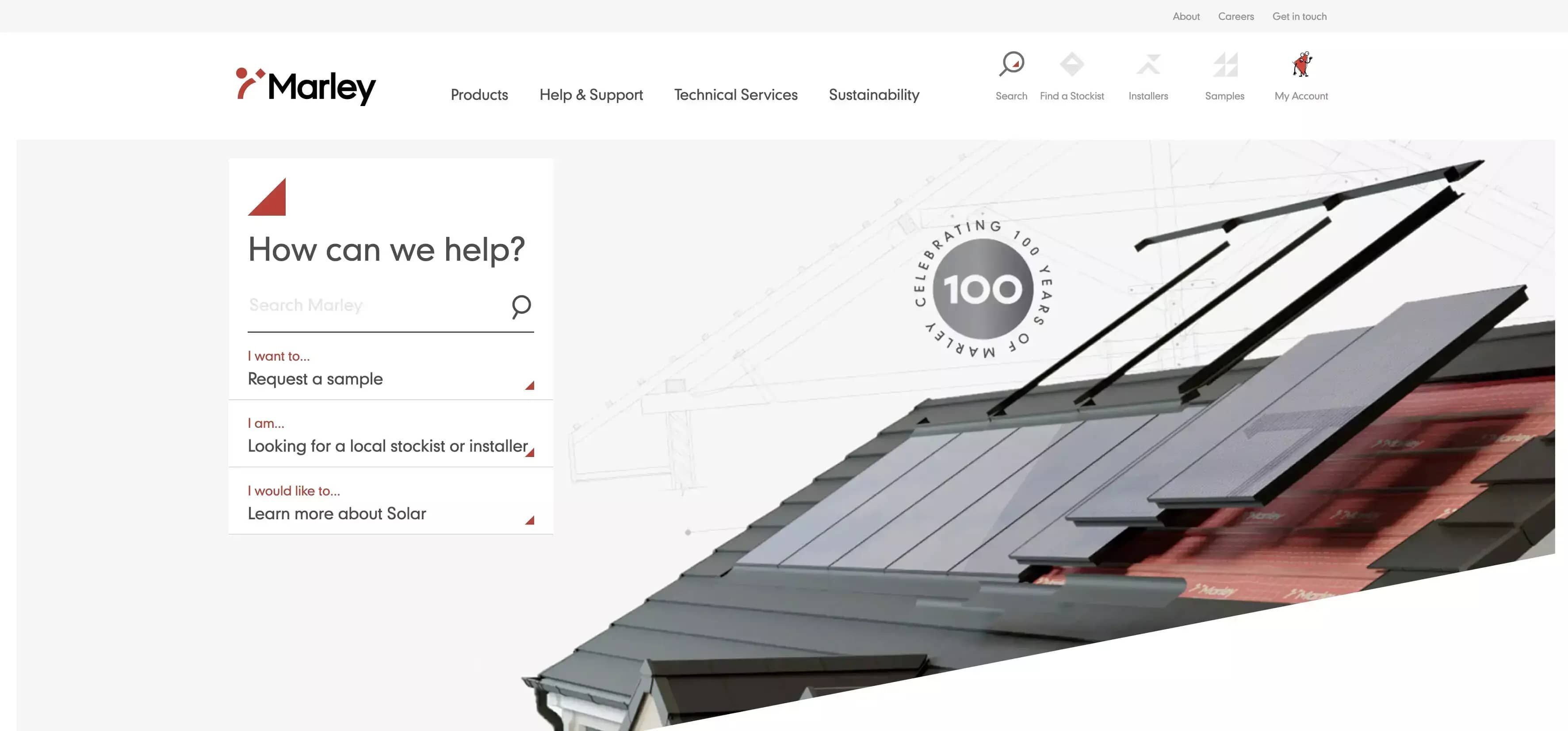
2. Marley
The main outstanding thing in Marley’s industrial website is how effectively it uses visual context to clarify product application right from the homepage.
Right from the hero section, a 3D-style image immediately shows where Marley’s roofing systems are used, eliminating ambiguity for first-time website visitors. The left side of the layout lays out the next steps clearly, Marley anticipates what users need, and removes the guesswork. Engineers, procurement staff, and decision-makers are guided straight to relevant resources with minimal clicks.
Despite the depth of information, the site is structured to remain intuitive. The mega menu breaks technical product information into logical, scannable categories. Conversion points like RFQ access and spec documentation are visually prioritized. The menu reflects how real buyers think, by material, function, or application, not by internal naming systems.
Your single takeaway in this manufacturing website example would be to make sure you use product-context visuals and buyer-aligned navigation to make it easier for technical users to get what they want, fast.
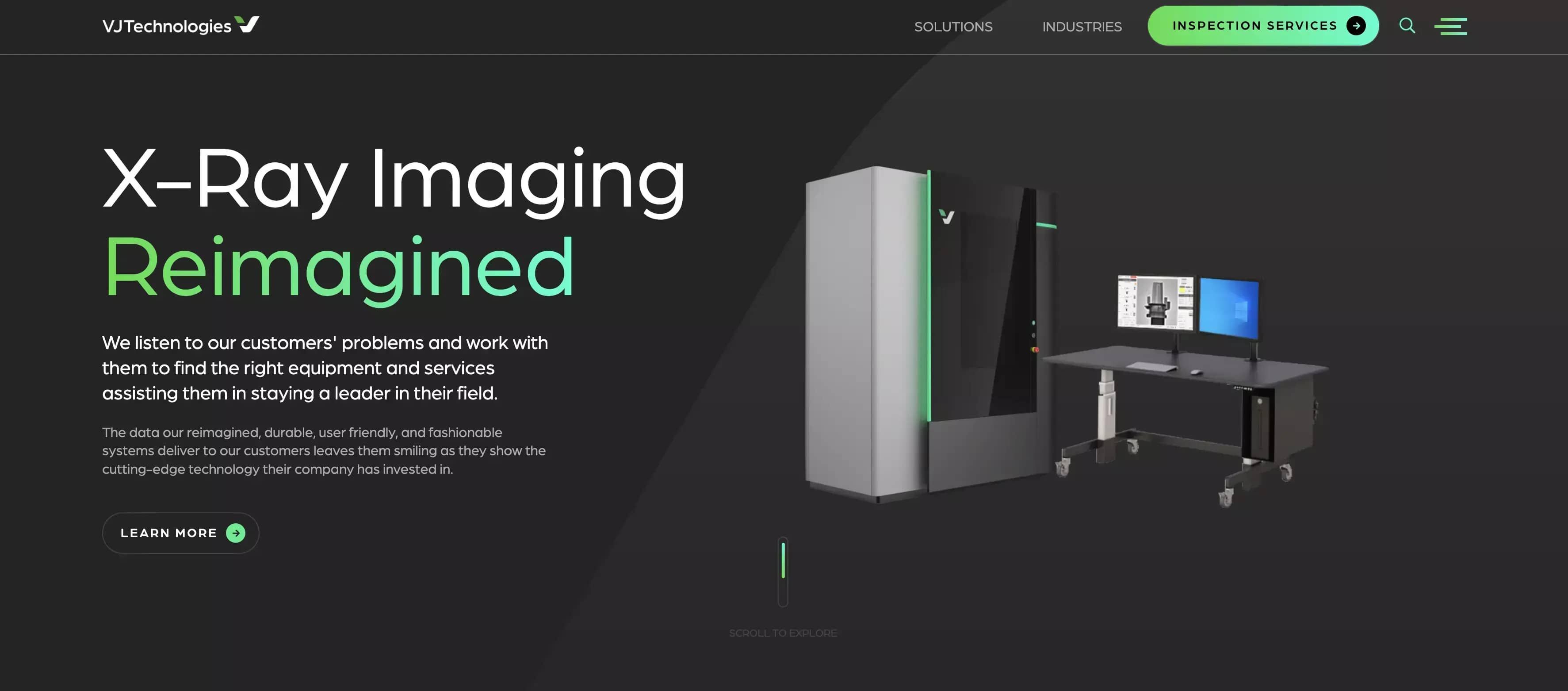
3. VJ Technologies
VJ Technologies’ manufacturing website delivers a premium, high-tech impression through bold visual styling and strategic UI choices.
From the start, the main pages and CTAs stay visible on desktop, while secondary content is housed in a hamburger menu (for non-technical readers, this is the three-line menu in most websites). This keeps the main navigation clean and task-focused, helping technical buyers move quickly toward the next step.
As you can see from the interface below, VJ Technologies chose bold and purposeful headlines. A green gradient highlights priority phrases for fast scanning. Premium product photography backs up messaging, giving potential customers clear visual cues alongside supporting text. CTAs are consistently placed and easy to access.
The dark theme creates contrast and a modern feel while maintaining legibility. Visual hierarchy and spacing guide users through the experience with clarity. Every major action point is easy to find and fast to engage with.
Although it depends on your branding, a bold design can grab attention quickly and establish confidence. This is especially true in typically conservative industries like manufacturing. But bold design without UX, easy navigation, usability, and CTAs can break trust just as fast as it can build it.
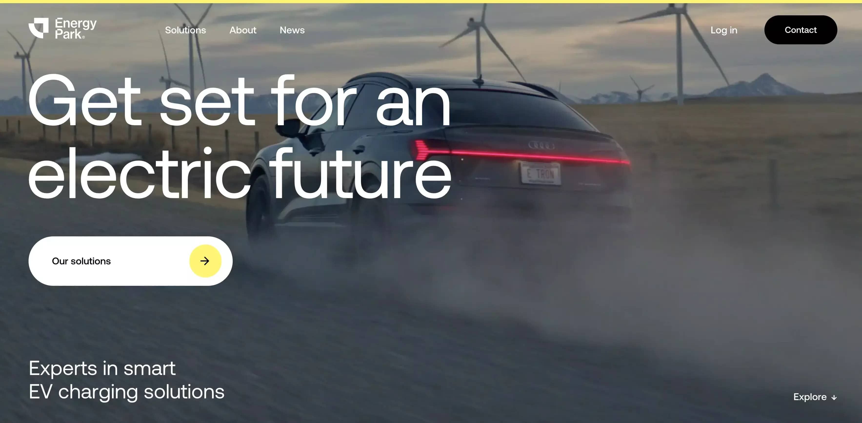
4. Energy Park
Energy Park’s manufacturing website effectively balances bold branding with practical clarity — a smart move for companies targeting modern, sustainability-focused buyers.
The homepage opens with a dynamic hero video that reinforces Energy Park’s positioning in the EV charging space. From there, the site transitions into still imagery and real-world product photos that help technical buyers and specifiers quickly understand product fit and use cases.
Each page provides focused product information without unnecessary distractions. Visuals support the copy, helping potential customers quickly grasp what’s being offered. CTAs and navigation remain simple and unobtrusive, helping users stay in flow without confusion or clutter.
The site’s minimalist design supports quick page loads and clean mobile performance, which is important for field-based users. The balance of branding, speed, and usability supports both first impressions and deeper exploration.
For the manufacturing industry, we suggest using homepage video sparingly and then switching to focused visuals and streamlined navigation to support product discovery and fast decision-making.
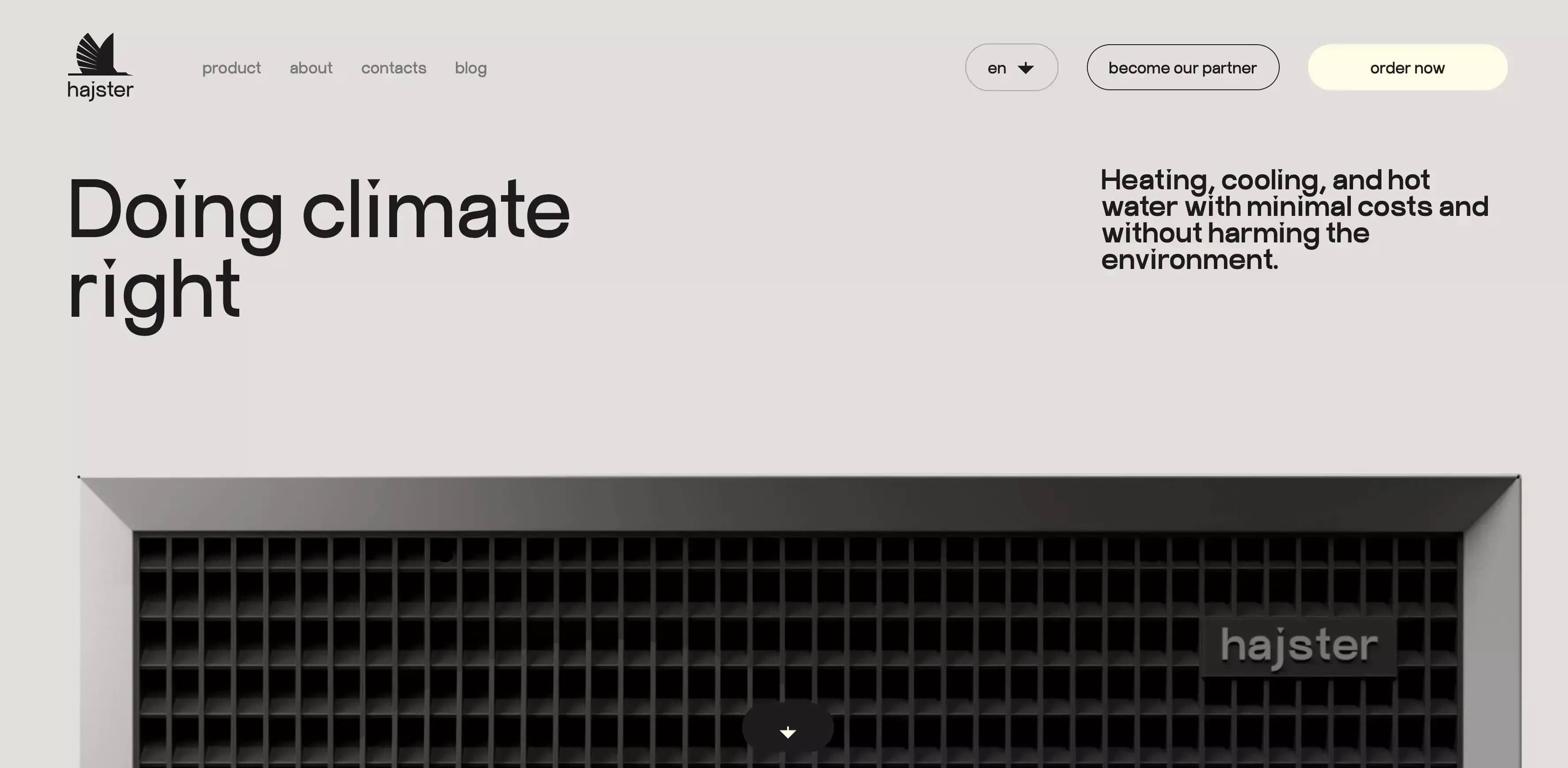
5. Hajster
Hajster’s manufacturing website breaks convention with a modern, animated experience that positions the brand as innovative and design-forward.
From the first scroll, users encounter clean layout transitions and subtle animations that guide attention to key information. Despite the creative design, navigation stays intuitive—visitors can explore product content without confusion, and core actions like contact and product detail pages are easy to reach.
Sleek product photography and interactive UI elements grab attention and boost brand value perception. While the content isn’t overly dense, it’s positioned to resonate with decision-makers and engineers alike. Animations highlight key benefits rather than distract from them, and CTAs are clearly positioned throughout.
The site uses controlled motion and responsive layout elements to create an engaging experience across all devices. Visual hierarchy is well-executed, and the clean aesthetic allows both marketing and technical content to shine.
If you want to stand out in a conservative space, smart animation and modern UX can help elevate your brand, without sacrificing clarity or usability.
These examples show what happens when manufacturing web design companies prioritize function over appearance, focusing first on usability, loading speed, and content clarity, then building the visual identity around what already works.
O8’s Website Design Projects
As a website design company, redesigns have been at the core of O8 since the beginning, rooted in UX design and development. We’ve led numerous in-house redesign projects and take pride in the results they’ve delivered.
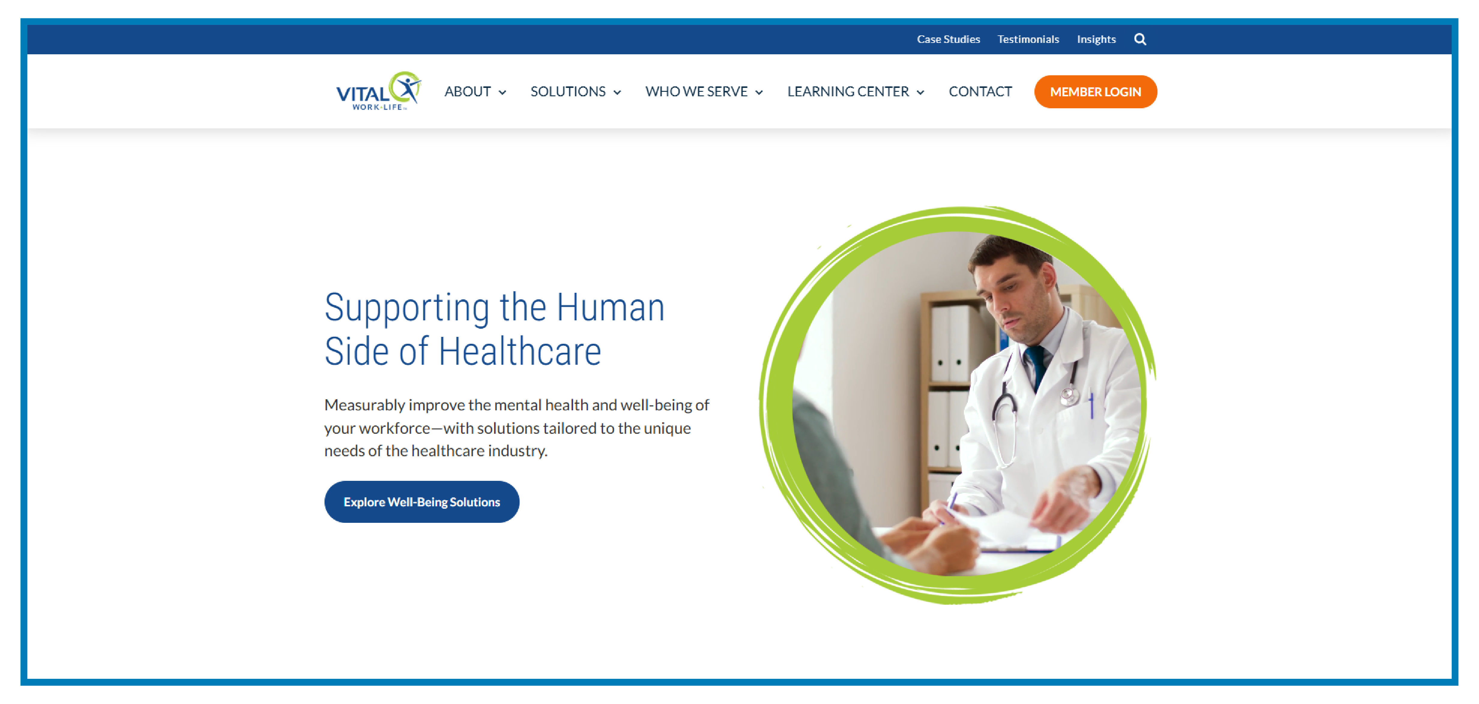
Exceeded Lead Generation Goal by 100%
For VITAL WorkLife, we led a full website redesign that resulted in lead volume doubling, and the cost per lead dropped by 37%. VITAL WorkLife hits the mark by offering tailored well-being solutions for the healthcare sector, connecting users to the services they need right off the bat.
The site effortlessly guides healthcare pros, like physicians and nurses, to resources perfectly suited to their mental health needs. Key sections, like well-being solutions and peer coaching, are easy to spot, so users find the support they need without any fuss.
CTAs for diving into solutions and reaching out to reps are front and center, making it simple for users to engage. Program details and success stories are easy to access, ensuring users quickly see the value of participating.
The design is crisp and user-friendly, with navigation that just makes sense. It’s mobile-ready, with a straightforward layout that keeps everything just a couple of clicks away.
We believe our great results with Vital Worklife were first because we tied the redesign to other strategies and a goal - increase lead generation, which exceeded our expectations. Secondly, we were able to deliver tailored solutions that speak directly to their different target audiences. By focusing on specific industry needs and making resources easily accessible, you boost engagement and satisfaction.
Brand Storytelling & Web Design for Brand Storytelling
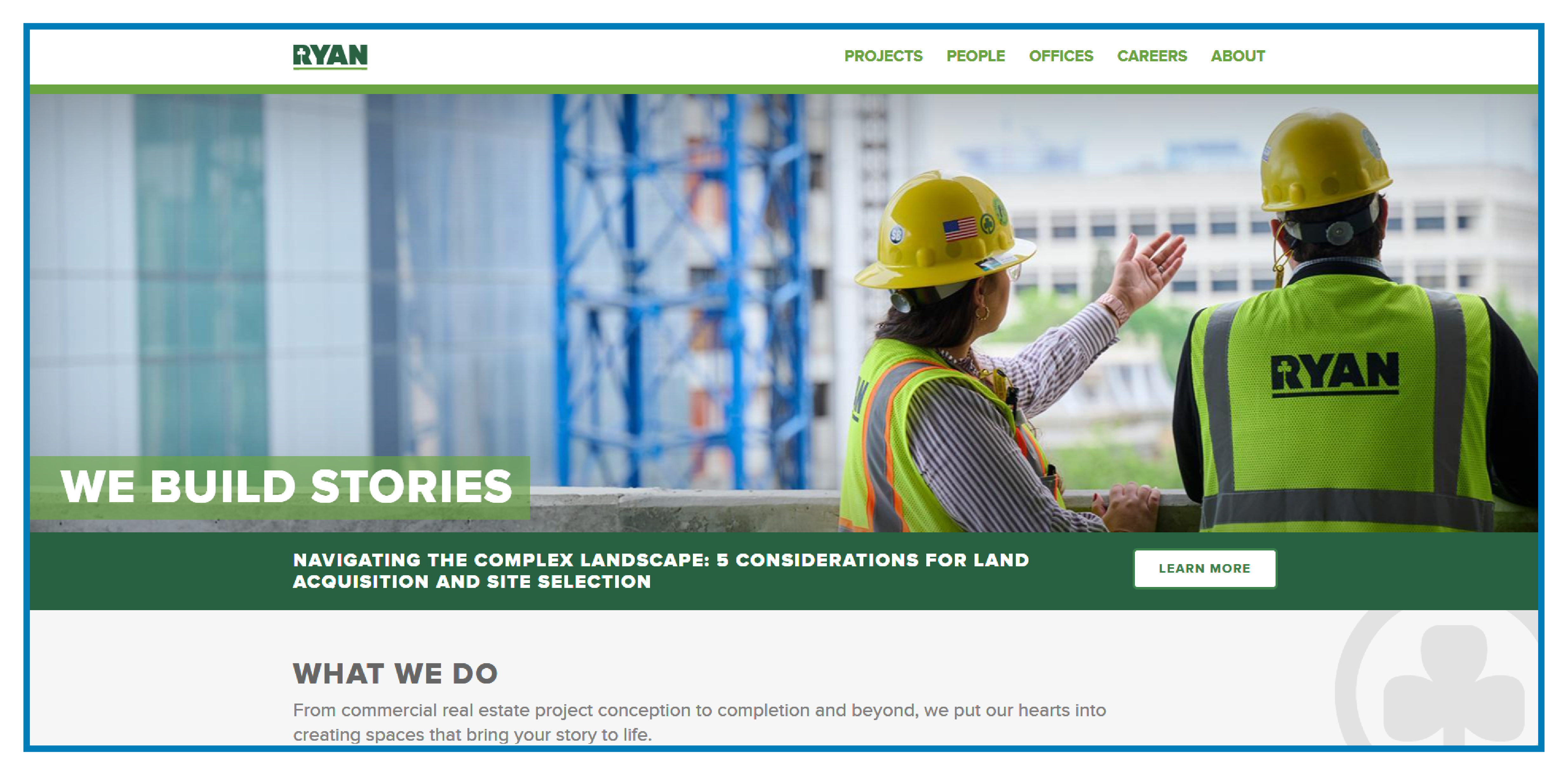
Ryan Companies excels in transforming commercial real estate visions into reality, seamlessly integrating the full spectrum of services from construction to capital markets.
With Ryan Companies, the goal was to simplify a complex story in commercial real estate. We reworked the content structure, made the visuals more intuitive, and built a fast, reliable site that resonated with both internal teams and the broader community.
The site effectively guides users, whether they’re potential clients in healthcare, industrial sectors, or mixed-use developments, through their desired services. Key areas like architecture, real estate management, and development are prominently displayed, making it easy for visitors to find exactly what they need.
CTAs for learning more about services and contacting representatives are well-placed, ensuring users can easily engage. Customer testimonials and project stories are readily accessible, providing a rich narrative that adds depth to their offerings.
The design is clean and professional, with intuitive navigation that enhances user experience. The site is mobile-friendly and features a straightforward hierarchy, allowing users to access services and stories with ease.
O8’s Agile, Growth-Driven Web Design for Manufacturers
Most manufacturing companies don’t have the time or budget to wait months for a complete website overhaul. At O8, we approach web development and design differently. We focus on building fast, functional websites that improve based on actual user data, not assumptions.
Here’s how our agile web design model supports the specific demands of the manufacturing industry:
- Fast initial deployment
We launch the most critical parts of your site early so you’re generating leads and collecting behavioral data while deeper development continues.
Consider this case study: The University of Minnesota Physicians, contacted us for our website design services and right after a focused discovery call, we quickly moved through UX and design rounds to produce a highly functional, visually aligned site. The phased delivery allowed momentum to build early in the process, resulting in a clean and high-performing final product.
Early launches allow critical feedback to surface before full rollout. For an industrial company with shifting specs or evolving catalogs, this means faster ROI and less risk of wasted build cycles.
Early launches allow critical feedback to surface before full rollout. For an industrial company with shifting specs or evolving catalogs, this means faster ROI and less risk of wasted build cycles.
- Data-driven updates
Every decision is backed by how real website visitors behave on the site. We measure performance across usability, speed, and conversion optimization, using that information to guide what gets built next.
- Modular content blocks
The website is structured using repeatable units. If you add a new product, change a spec, or update documentation, your internal team can handle those edits without restructuring the site.
- Built for change
When your catalog shifts or regulations tighten, the site can evolve with minimal friction. No need to start over. In another scenario for IgnitEd’s redesign, we reorganized the course resources page and removed detailed sidebar filters. This shifted the focus to curriculum topics and gave the experience a clearer visual and navigational hierarchy.
Modular layouts improve flexibility. For manufacturers, this supports fast changes to product specs, datasheets, and media without backend delays — ideal for product launches or regulatory shifts.
- Continuous improvement
We focus on measurable progress. Each update is released in cycles and tested to ensure it solves real problems for your users.
We do not rely on big-bang launches. We build performance engines. Agile, not fragile.
Build a Site That Sells
Use proven manufacturing marketing strategies to turn your website into a lead-generating machine. We’ll help you align design, UX, and messaging with what actually drives sales.
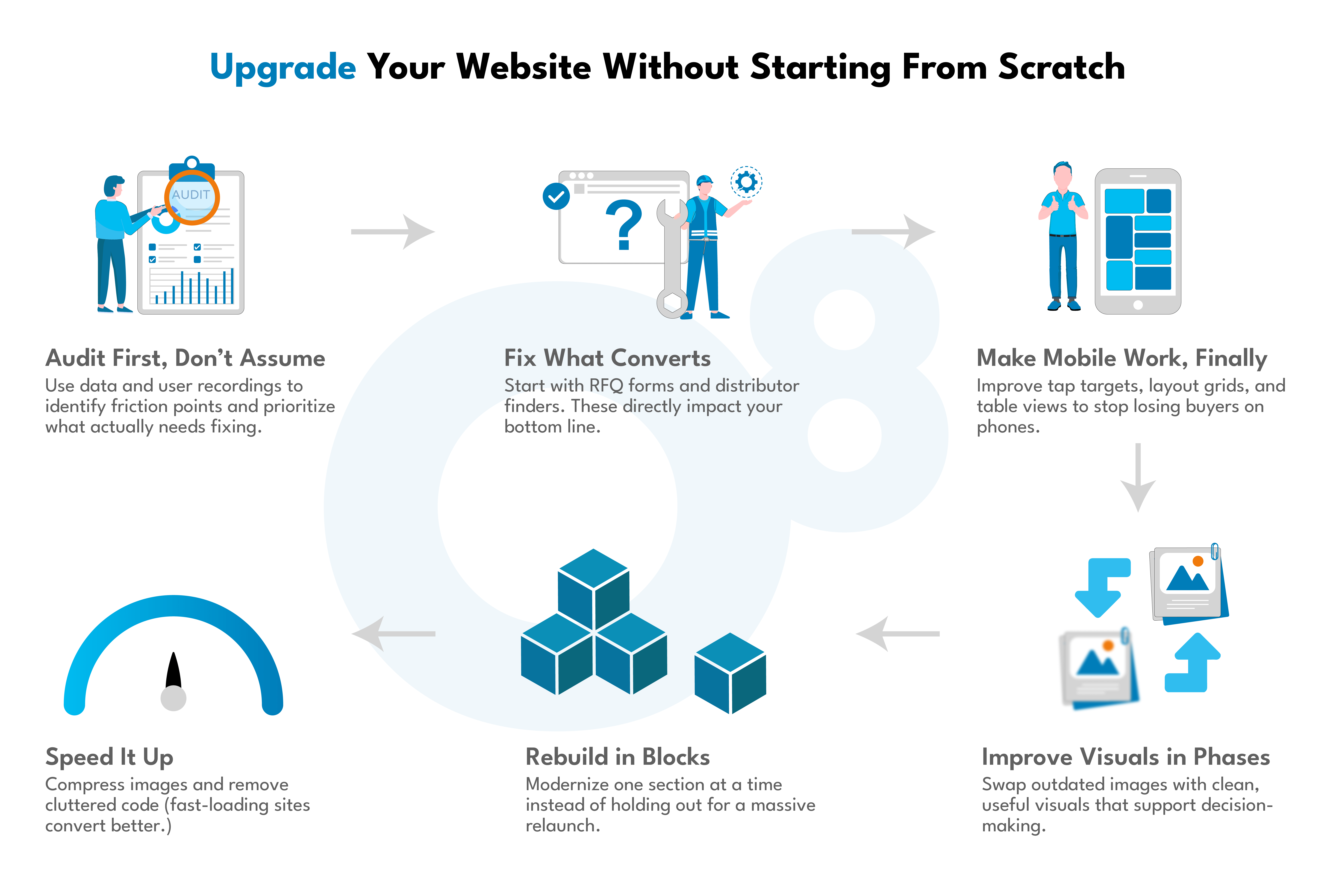
Budget-Friendly Web Redesign Strategies for Manufacturers
Redesigns don’t need to be massive to be effective. It’s about upgrading what matters most. Many industrial company websites can see measurable improvement through focused, staged web design updates.
The key is to concentrate on UX and functionality that directly supports how engineers, procurement teams, and technical buyers use the site. Here are practical, cost-conscious ways manufacturers can improve their sites:
Use data from analytics tools and user recordings to understand where visitors drop off, what they ignore, and what they interact with. Focus redesign efforts where friction is highest and value is clearest.
- Start with conversion paths
Prioritize high-intent pathways like RFQ forms, distributor locators, and quote requests — the content that leads directly to sales conversations.
Small changes in layout or form usability can remove unnecessary clicks and improve completion rates—essential for conversion optimization. For instance, O8's B2B web design services focus on creating user-centric designs that enhance conversion rates.
- Improve mobile functionality
Many older manufacturing websites still underperform on mobile, frustrating potential buyers. Instead of rebuilding from scratch, targeted improvements—like adjusting layouts for smaller screens, fixing touch areas, and making product tables easier to read—can go a long way. With over global website traffic coming from mobile devices, improving mobile experience is a fast win for accessibility and engagement.
- Upgrade visuals gradually
You don’t need a rebrand to look more modern. Start by replacing outdated product images with accurate visuals or clean renderings. Focus on consistency across images, and when it helps the buyer, include photos of your product in real-world use. These small upgrades build trust and improve decision-making, without the cost of a complete overhaul.
- Optimize performance
Compress large images, remove unused scripts, and minimize render-blocking code. These actions improve load times and directly support inbound marketing results. Utilizing image optimization techniques can significantly enhance website speed and performance.
With HelpSystems, we conducted a conversion rate optimization (CRO) analysis, gathering data from analytics, heat maps, and heuristic site walkthroughs to improve business-critical conversions.
The Role of UX and Technical Buyers: How Modern Web Design Educates & Converts
For technical buyers, a website isn’t just a marketing tool—it’s part of the decision-making process. That’s why modern UX in manufacturing must go beyond visual design and focus on buyer enablement.
If an engineer or procurement lead can’t easily locate spec sheets, CAD files, lead times, or installation guides, they’re not likely to reach out. Poor UX introduces friction, stalls deals, and adds time to the sales cycle.
At O8, we address this by building role-specific navigation that quickly routes each stakeholder to the content most relevant to them. Engineers find documentation. Procurement teams get pricing details and RFQ access. Operations sees delivery options and service timelines—all without unnecessary clicks.
Content is structured for usability: technical materials are scannable, searchable, and accessible across devices. CTAs are mapped to user intent, not just page placement.
The impact is measurable. A well-structured user interface can increase conversion rates by up to 200%, while sound user experience design can push that to 400%.
Effective UX isn't about flash, it’s about reducing time to quote, building trust, and supporting informed, confident buying decisions.
FAQs
Yes. O8 builds high-performing manufacturing websites using tools like Drupal, Acquia, and Pantheon for scalable CMS and hosting. We integrate with HubSpot, Salesforce, and 6sense for CRM and ABM, and use Drift and Cludo to enhance UX, search, and lead conversion.
Most B2B buyers research independently before contacting sales. A site that clearly organizes specs, quote options, compliance data, and CAD files helps shorten decision time and reduces sales-team overhead.
A high-converting manufacturing website design minimizes friction by giving technical buyers direct access to the information they need. This includes proper content hierarchy, role-based flows, fast loading speeds, and access to documentation without dead ends.
Start with user intent. Organize interfaces based on how engineers, procurement officers, and managers search for information. Use clear headings, sticky elements, and structured menus that support deep product exploration.
Conclusion
In manufacturing, performance means functionality not visual flair. It’s about uptime, clear information hierarchy, quick access to RFQ forms, and UX patterns that respect how technical buyers think.
Page speed, mobile stability, metadata accuracy, and intuitive paths to spec sheets and CAD files all impact whether a website visitor converts or bounces.
That’s why a continuous model (where real data guides updates) makes sense. If users are missing CTAs or dropping off product pages, you should know and fix it. You can’t afford to wait for the next redesign cycle.
Instead of letting your site grow stale, build one that adapts. One that supports product line shifts, evolving documentation, and real sales conversations.
Outdated Manufacturing Website Costing You Leads?
We’ll audit your site’s performance, UX, and conversion blockers fast.